

Paint the whole RISC OS world with a rainbow!
There can’t be many RISC OS users who haven’t encountered a modern touchscreen device, such as a smartphone or a tablet computer – indeed, R-Comp have been selling a tablet now for a couple of years, and have made quite a big thing about it, so it’s difficult to imagine how any RISC OS user could have missed the technology.
Smartphones and tablets are often very powerful computers in their own right, but – surely everyone knows – they’re designed to be handheld devices, which are very mobile, easily carried and fit into pockets or small bags, and as such they are distinct from what most would think of as their “bigger brothers” – PCs, which in this case stands for “Proper Computers.”
Well, in this case, everyone who knows that would be wrong.
The technologies are merging, and in time both laptop and desktop computers as we know them will disappear, to be replaced by computers that can be used in all three configurations: As a tablet on its own, as a laptop with a keyboard attached along the long side, and as a desktop with a separate keyboard, mouse and larger screen attached.
Microsoft have already realised this, and that’s why they have taken Windows 8 in the direction they have, with an interface that still works well with mouse and keyboard, but is equally well suited to touchscreen use.
But what about RISC OS?
The subject of using RISC OS on touchscreen devices has come up from time to time on various RISC OS forums – and the consensus has always tended to be that the interface as it stands just won’t work: The standard window furniture is too small for fat fingers, as are some of the style-guide mandated icon and tool sizes, and then there’s the issue of what gestures (movements of the fingers on the touchscreen) work best as translations for the three mouse buttons – not to mention where keyboard modifiers are used. The only conclusion that can be drawn from such discussions is that the RISC OS user interface would need a radical overhaul for it to be truly suitable for touchscreen use.
And then there’s all the new blood to consider: New users coming to RISC OS for the first time thanks to cheap hardware such as the Raspberry Pi. While many of these new users will be accustomed to using desktop operating systems such as Windows, MAC OSX and various Linux distros, and will thus be comfortable using the mouse to point and click, it’s fair to say that the RISC OS user interface can still be confusing. It’s also reasonable to expect that a large number of new users, particularly younger people, will be more accustomed to using touchscreen interfaces – and that number will increase with the popularity of touchscreen devices, especially if their use becomes more and more widespread due to merging of desktop, laptop, tablet and smartphone technologies and form factors. Again, the only conclusion that can be drawn is that the RISC OS user interface needs to be overhauled, this time to make it seem less alien to new users.
After last year’s Wakefield Show, two new RISC OS users who had already found themselves confused and flustered by the somewhat strange user interface, and who were both visionary enough to see that a change was absolutely necessary for the future of RISC OS, decided to do something about it. They brought together a group of developers and other interested parties to discuss these very issues: How can we make the RISC OS user interface workable on touchscreen devices – while still perfectly usable with keyboard and mouse? And how can we make it more approachable and friendly for new users?
That meeting, it seems, was very productive, with one idea standing out above all the others, and a development team was put together and tasked with taking that idea and making it a reality.
That reality is finally here.
With this year’s Wakefield Show fast approaching, I was recently invited along for a sneak preview of what that meeting led to – the results of almost a year’s full-time development for the team that was put together – and, at last, RISCOSitory can exclusively reveal it to the world at large.
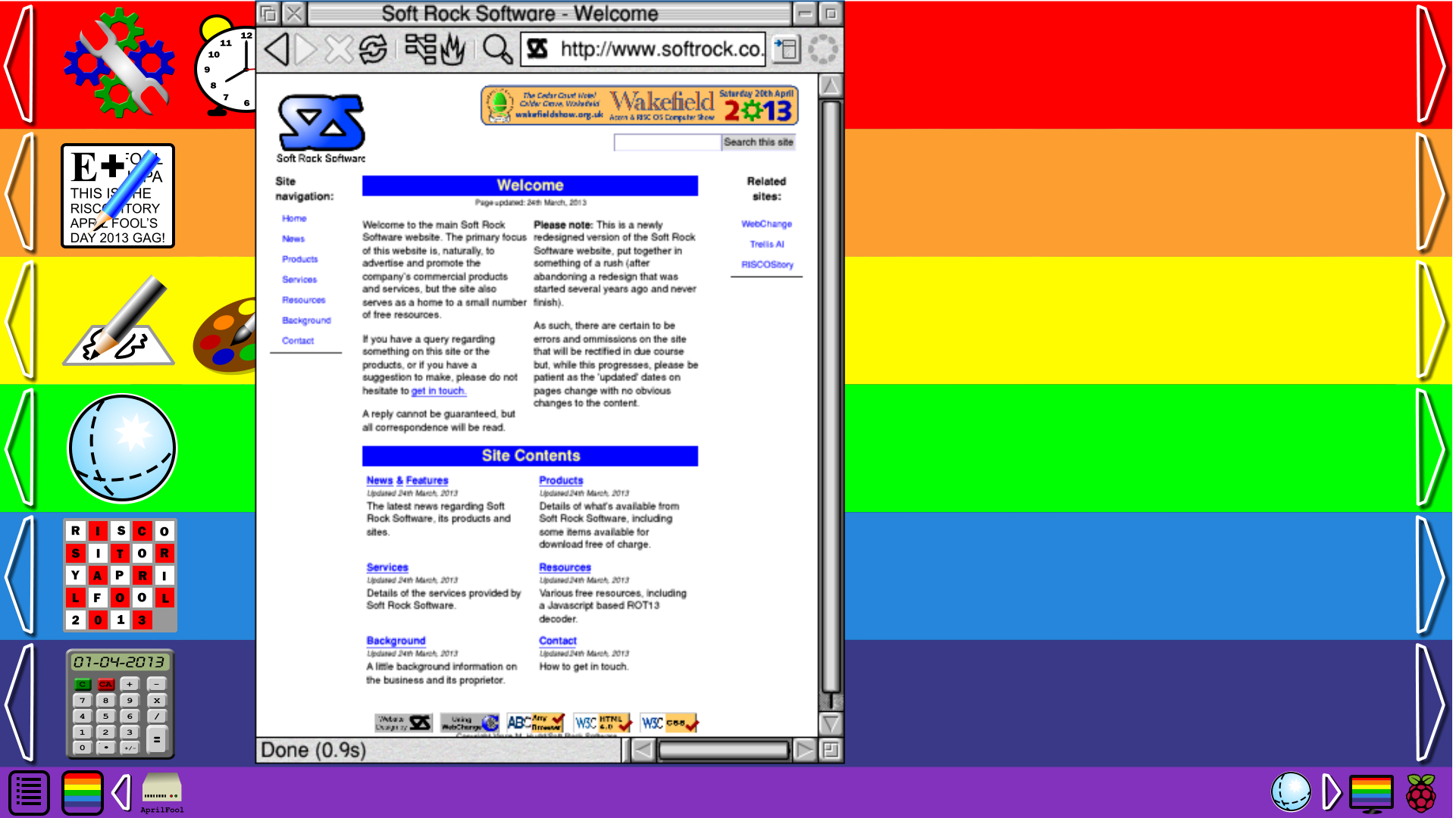
The new, touch-friendly user interface is called The Rainbow Interface, and it will debut in a whole new version of the operating system: RISC OS 7, which will be formally called RISC OS Rainbow.
With one of the reasons for the user interface overhaul being new users, the starting point for the new interface was what users saw when they first switched the computer on. By default, a system running up to RISC OS version 6 would show the desktop, with the icon bar at the bottom – and the icon bar is usually the starting point, with the Apps icon, in effect, being the standard application launcher. On modern touchscreen devices, however – and on Windows 8, even if it’s not being used on a touchscreen device – the default is a grid of icons, widgets and tiles. The exact terminology varies according to which platform you are using, but those icons and tiles launch programs, and those widgets and (active)tiles display information from programs running in the background. In a way, the whole screen is like an icon bar and start menu rolled into one.
And that was the inspiration for the rainbow interface.
The screen is divided up into seven horizontal bands, each coloured according to the rainbow, with red at the top and violet at the bottom. The violet band is in many ways the traditional icon bar, retaining most of its existing properties, but lacking some of its more familiar icons, or seeing them replaced with new ones – but more on that later.
The boot sequence is similarly divided, with subsidiary boot sequences corresponding to each of the seven bands in the new interface – red through to violet – allowing each to have its own choices, primarily dealing with which applications are shown on that band. The idea is that users can use the top six bands (i.e. not the violet band, which is really the icon bar) to represent different types of application, and the defaults represent that, with bundled apps being divided into:
- Red: System and administrative.
- Orange: Office and productivity applications.
- Yellow: Graphics, sound and video applications.
- Green: Internet and networking applications.
- Blue: Games and diversions.
- Indigo: Miscellaneous applications.
Within each band’s configuration (and boot sequence), it can be told to either “Show” or “Open” applications. These are similar to the old-style “Add to apps” and “Run” options, but with terminology that’s considered slightly more user friendly, and more representative of what they do in the context of the rainbow interface.
If you set a band to “Show” an application, its 148 x 148 “static tile” (rather than sprite) will be displayed on the band, scaled as necessary for lower resolution screens, and tapping the tile (or clicking on it with a mouse) will “Open” it. If you choose to “Open” an application – by tapping on it, or by configuring the band to open it – then it will be launched, and its “interactive tile” will be opened and, if the app so chooses, an icon placed on the violet band. Interactive tiles are best thought of as special windows, designed to fit vertically inside a band, and which remain part of that band. They allow the application to display information, and can even accept some input from the user – but they can also be used to open an application’s larger, more traditional windows.
New applications, written with the rainbow interface in mind, can define their own interactive tiles and what interactions are possible within them – for example, the interactive tile for the Calc application is a working calculator, and the sliding puzzle game’s tile is a working game. Old-style applications, however, aren’t left out – any application that doesn’t set up its own interactive window gains a default one, which initially contains a copy of its violet band icon, and as windows are opened by the application, iconised versions are added to its interactive tile, and tapping on any of these will (re)open the corresponding window or bring it to the front.

The bands can be wider than the screen, and each can be scrolled left or right independently of the others. The left and right edges of each band are the band’s scroll-areas, indicated by an outline arrow, and keeping a finger pressed in either (or clicking and holding with the mouse) will cause that band to scroll. (One of the developers I spoke to suggested that it might be possible to turn this aspect of the rainbow interface into a game in its own right, whereby bands can be scrolled left or right to cause tiles to drop into spaces in the band below – I’m not entirely sure if he was joking or not!)
As noted above, the violet band is a special case, in essence being a replacement for the old-style icon bar. At the original meeting, the idea put forward was to have seven bands plus the icon bar, but when the initial versions were produced, it looked decidedly odd, as though the rainbow had gained an eighth, grey band. This led to the decision to make it seven bands, with the seventh – violet – replacing the icon bar. Once a version was produced in this configuration, it was immediately clear that this was a much better proposition: It looked right.
As the icon bar’s replacement, the violet band shares some of its properties. The most obvious similarity is that it bears the old icon bar’s height, rather than sharing the same height as the other six bands. This was a fairly obvious decision because if it was the same as the other bands, it would be one seventh of the entire screen height, which is far too much on modern high resolution displays – the version I saw running was using a 1920×1080 display, which would have meant for a 154/155 pixel icon bar, and that would have been ludicrous! Plus, by keeping the violet band the same height as the old icon bar, it would be ideally sized for those icons normally put on the bar, and would therefore minimize the amount of work necessary to update old apps for the new interface.
And it was pointed out to me that the icon bar’s height is actually ideal for a touch interface – were Acorn thinking this far ahead when they first developed it, I wonder?
The violet band/icon bar’s subsidiary boot sequence lacks the new “Show” and “Open” options, since these are more applicable to the other six bands, but it does retain the old “Look at” option, which allows the system to run an application’s boot file, and thus set up any system variables, etc.
There are differences in the icons that appear on the violet band, as well.

The leftmost icon is a brand new one, never before seen in RISC OS, and is designed to cater specifically for people using it on a touchscreen device. This is the Menu icon. A tap on this will call up the context-sensitive menu for whatever application is currently in use, with that menu appearing above the icon and sized appropriately for touch. However, don’t worry if you’re a die-hard mouse-user – while a mouse click on the icon will achieve the same thing, clicking the Menu button over the application window will still work the way it always has!

The next icon along is a replacement for the old-style Apps icon, and is called the Rainbow icon. A tap (or a click) on this will bring the rainbow interface to the front, hiding all open windows and giving easy access to all the applications a user has installed, assuming one of the bands is set to “Show” them – which, ideally, they should.
After these two, any device icons will appear – disc drives, printers and so on.

At the other end, the rightmost icon is still the Switcher icon, which works the same as it did before, and the icon before that still gives quick access to the display settings – though it has been updated in two ways: Firstly, it represents a modern TFT display and secondly, it shows the rainbow interface rather than the old RISC OS desktop. To the left of these, the icons that appear will be those put there by applications, just as before.
Another difference is the way the violet band scrolls. If the old icon bar became full, it would expand so that it was wider than the screen, and hovering the mouse at either end would cause it to scroll. That ability is retained, but whereas the entire icon bar would scroll, with the violet band two icons at each end are fixed (Menu and Rainbow on the left, Display and Switcher on the right), and its the area of the band between these that scrolls if necessary. As with the other bands, though, this is now done by pressing and holding in the scroll-area (which, unsurprisingly, is at the edge of the area that can be scrolled, rather than the edges of the violet band, beyond the fixed icons), rather than by hovering the mouse.
The other key point brought up at the meeting was the window furniture, etc. The developers told me they were originally anticipating some difficulties adapting RISC OS to cope with larger tools and icons, because these aspects were hardwired into the operating system. They’d concluded that doubling the size of the standard tools made them just right for use in a touch-based interface – and were very pleasantly surprised to discover that doubling the size of these icons was remarkably easy: RISC OS positively lent itself to that specific change. It again almost seems as though Acorn had anticipated this very problem, right back at the beginning – and that’s almost too hard to believe.
So that’s an overview of what you can expect to see in newest version of our beloved operating system. RISC OS Rainbow will be sold through a new company, All-Purpose Rainbow Interface Limited, headed up by those two visionary new users, Faegan O‘Reilly and Ollie Larkin. Look out for their stand at Wakefield 2013.
And, finally, here’s a full-sized (1920 x 1080) screen-grab of RISC OS Rainbow: